Comparing data with parametric distributions
A parametric test is one which makes particular assumptions about the mathematical nature of the population distribution from which the samples were taken. If these assumptions are not true, then the test is obviously invalid, even though it might give the answer we expect! A non-parametric test does not assume that the data fit a particular pattern, but it may assume some things about the distributions. Used in appropriate circumstances, parametric tests are better able to distinguish between true but marginal differences between samples than their non-parametric equivalents (i.e. they have greater 'power').The distribution pattern of a set of data values may be chemically relevant, but it is also of practical importance because it defines the type of statistical tests that can be used. The properties of the main distribution types found in chemistry are given below with both rules of thumb and more rigorous tests for deciding whether data fit these distributions.
Binomial distributions These apply to samples of any size from populations when data values occur independently in only two mutually exclusive classes (e.g. type A or type B). They describe the probability of finding the different possible combinations of the attribute for a specified sample size k (e.g. out of 10 samples, what is the chance of 8 being type A?). If p is the probability of the attribute being of type A and q the probability of it being type B, then the expected mean sample number of type A is kp and the standard deviation is √(kpq). Expected frequencies can be calculated using mathematical expressions (see Miller and Miller, 2000). Examples of the shapes of some binomial distributions are shown in Fig. 41.2. Note that they are symmetrical in shape for the special case p = q = 0.5 and the greater the disparity between p and q, the more skewed the distribution.
Chemical examples of data likely to be distributed in a binomial fashion occur when an observation or a set of trial results produce one of only two possible outcomes; for example, to determine the absence or presence of a particular pesticide in a soil sample. To establish whether a set of data is distributed in binomial fashion: calculate expected frequencies from probability values obtained from theory or observation, then test against observed frequencies using a χ2-test or a G-test.
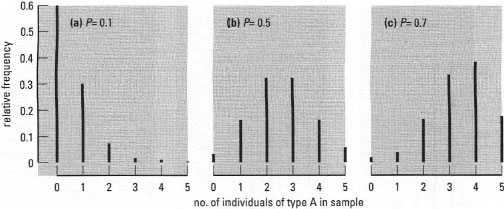 |
| Fig. 41.2 Examples of binomial frequency distributions with different probabilities. The distributions show the expected frequency of obtaining n individuals of type A in a sample of 5. Here P is the probability of an individual being type A rather than type B. |
Poisson distributions
These apply to discrete characteristics which can assume low whole-number values, such as counts of events occurring in area, volume or time. The events should be 'rare' in that the mean number observed should be a small proportion of the total that could possibly be found. Also, finding one count should not influence the probability of finding another. The shape of Poisson distributions is described by only one parameter, the mean number of events observed, and has the special characteristic that the variance is equal to the mean. The shape has a pronounced positive skewness at low mean counts, but becomes more and more symmetrical as the mean number of counts increases (Fig. 41.3).
An example of data that we would expect to find distributed in a Poisson fashion is the number of radioactive disintegrations per unit time. One of the main uses for the Poisson distribution is to quantify errors in count data such as the number of minor accidents in the chemical laboratory over the course of an academic year. To decide whether data are Poisson distributed:
- Use the rule of thumb that if the coefficient of dispersion ≈ 1, the distribution is likely to be Poisson.
- distribution and compare with actual values using a χ2-test or a G-test.
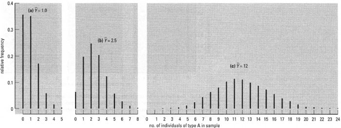 |
| Fig.41.3 Examples of Poisson frequency distributions differing in mean. The distributions are shown as line charts because the independent variable (events per sample) is discrete. |
Normal distributions (Gaussian distributions)
These occur when random events act to produce variability in a continuous characteristic (quantitative variable). This situation occurs frequently in chemistry, so normal distributions are very useful and much used. The belllike shape of normal distributions is specified by the population mean and standard deviation (Fig. 41.4): it is symmetrical and configured such that 68.27% of the data will lie within ±1 standard deviation of the mean, 95.45% within ±2 standard deviations of the mean, and 99.73% within ±3 standard deviations of the mean.
Normal distributions (Gaussian distributions)
These occur when random events act to produce variability in a continuous characteristic (quantitative variable). This situation occurs frequently in chemistry, so normal distributions are very useful and much used. The belllike shape of normal distributions is specified by the population mean and standard deviation (Fig. 41.4): it is symmetrical and configured such that 68.27% of the data will lie within ±l standard deviation of the mean, 95.45% within ±2 standard deviations of the mean, and 99.73% within ±3 standard deviations of the mean.
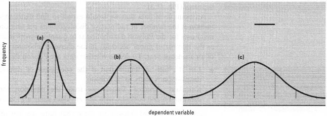 |
| Fig. 41.4 Examples of normal frequency distributions differing in mean and standard deviation. The horizontal bars represent population standard deviations for the curves, increasing from (a) to (c). Vertical dashed lines are population means, while vertical solid lines show positions of values ±1, 2 and 3 standard deviations from the means. |
Some chemical examples of data likely to be distributed in a normal fashion are pH of natural waters; melting point of a solid compound. To check whether data come from a normal distribution, you can:
- Use the rule of thumb that the distribution should be symmetrical and that nearly all the data should fall within ±3s of the mean and about two-thirds within ±1s of the mean.
- Plot the distribution on normal probability graph paper. If the distribution is normal, the data will tend to follow a straight line (see Fig. 41.5).
- Deviations from linearity reveal skewness and/or kurtosis, the significance of which can be tested statistically (see Miller and Miller, 2000).
- Use a suitable statistical computer program to generate predicted normal curves from the Ÿ (Y bar) and s values of your sample(s). These can be compared visually with the actual distribution of data and can be used to give 'expected' values for a χ2-test or a G-test.
A very important theorem in statistics, the central limit theorem, states that as sample size increases, the distribution of a series of means from any frequency distribution will become normally distributed. This fact can be used to devise an experimental or sampling strategy that ensures that data are normally distributed, i.e. using means of samples as if they were primary data.
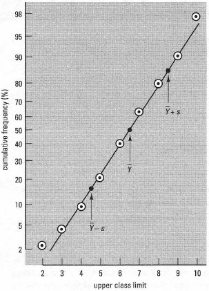 |
| Fig.41.5 Example of a normal probability plot. The plotted points are from a small data set where the mean Ÿ (Y bar) = 6.93 and the standard deviation s = 1.895. Note that values corresponding to 0% and 100% cumulative frequency cannot be used. The straight line is that predicted for a normal distribution with Ÿ (Y bar) = 6.93 and s = 1.895. This is plotted by calculating the expected positions of points for Ÿ (Y bar) ± s. Since 68.3% of the distribution falls within these bounds, the relevant points on the cumulative frequency scale are 50 ± 34.15%; thus this line was drawn using the points (4.495, 15.85) and (8.285, 84.15) as indicated on the plot |
Support our developers