Chemistry Lab Protocols / Analysis and presentation of data
Types of graph
Different graphical forms may be used for different purposes, including:
- Plotted curves - used for data where the relationship between two
variables can be represented as a continuum.
- Scatter diagrams - used to visualize the relationship between individual
data values for two interdependent variables (e.g. Fig. 41.6) often as a
preliminary part of a correlation analysis.
- Three-dimensional graphs show the inter-relationships of three variables,
(e.g. Fig. 32.21).
- Histograms for frequency distributions of continuous variables (e.g.
Fig. 37.3).
- Frequency polygons emphasize the form of a frequency distribution by
joining the co-ordinates with straight lines, in contrast to a histogram.
This is particularly useful when plotting two or more sets of data values
on the same graph.
- Bar charts represent frequency distributions of a discrete qualitative or
quantitative variable (e.g. Fig. 37.4).
- Pie charts illustrate portions of a whole (e.g. Fig. 37.5).
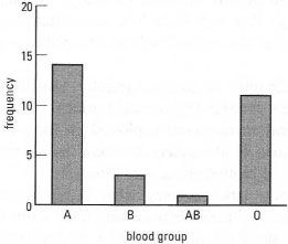 |
| Fig. 37.4 Bar chart: showing the number of students belonging to each ABO blood group (n = 29). |
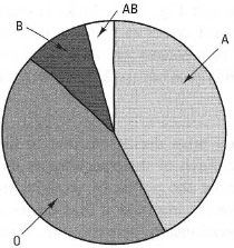 |
Fig. 37.5 Pie chart: relative abundance of ABO
blood groups in man. |
Support our developers

More in this section