Practical aspects of graph drawing
The following comments apply to graphs drawn for laboratory reports. Figures for publication, or similar formal presentation, are usually prepared according to specific guidelines, provided by the publisher/organizer.Two examples of graphs are shown (Fig. 37.1 and 37.2). The first is typical in quantitative analytical chemistry (Fig. 37.1), while the second is typical in physical chemistry (Fig. 37.2).
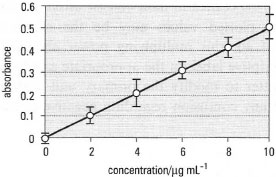 |
| Fig. 37.1 Calibration curve for the determination of lead in soil using FAAS. Vertical bars show standard errors (n = 3). |
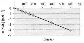 |
| Fig. 37.2 Decomposition of N2O5. The firstorder rate constant can be determined from the slope of the line. |
*Note: Graphs should be self-contained - they should include all material necessary to convey the appropriate message without reference to the text. Every graph must have a concise explanatory title to establish the content. If several graphs are used, they should be numbered, so they can be quoted in the text.
- Consider the layout and scale of the axes carefully. Most graphs are used to illustrate the relationship between two variables (x and y) and have two axes at right angles (e.g. Figs 37.1 and 37.2). The horizontal axis is known as the abscissa (x-axis) and the vertical axis as the ordinate (y-axis).
- The axis assigned to each variable must be chosen carefully. Usually the x-axis is used for the independent variable (e.g. concentration) while the dependent variable (e.g. concentration response) is plotted on the y-axis. When neither variable is determined by the other, or where the variables are interdependent, the axes may be plotted either way round.
- Each axis must have a descriptive label showing what is represented, together with the appropriate units of measurement, separated from the descriptive label by a solidus or 'slash' (/), as in Fig. 37.1, or brackets as in Fig. 37.2.
- Each axis must have a scale with reference marks ('tics') on the axis to show clearly the location of all numbers used.
- A figure legend should be used to provide explanatory detail, including the symbols used for each data set.
Handling very large or very small numbers
To simplify presentation when your experimental data consist of either very large or very small numbers, the plotted values may be the measured numbers multiplied by a power of 10: this multiplying power should be written immediately before the descriptive label on the appropriate axis (as in Fig. 37.3). However, it is often better to modify the primary unit with an appropriate prefix to avoid any confusion regarding negative powers of 10.
Size
Remember that the purpose of your graph is to communicate information. It must not be too small, so use at least half an A4 page and design your axes and labels to fill the available space without overcrowding any adjacent text. If using graph paper, remember that the white space around the grid is usually too small for effective labelling. The shape of a graph is determined by your choice of scale for the x- and y-axis which, in turn, is governed by your experimental data. It may be inappropriate to start the axes at zero. In such instances, it is particularly important to show the scale clearly, with scale breaks where necessary, so the graph does not mislead.
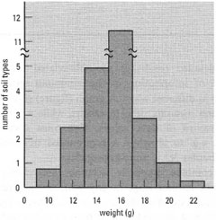 |
| Fig. 37.3 Frequency distribution of weights for a range of different soil types (sample size 24085); the size class interval is 2 g. |
Graph paper
In addition to conventional linear (squared) graph paper, you may need the following:
- Probability graph paper. This is useful when one axis is a probability scale.
- Log-linear graph paper. This is appropriate when one of the scales shows a logarithmic progression, e.g. in chemical kinetics. A plot of In k against I/T is used to determine the activation energy (Ea), where k is the rate constant and T is the temperature. Log-linear paper is defined by the number of logarithmic divisions covered (usually termed 'cycles') so make sure you use a paper with the appropriate number of cycles for your data. An alternative approach is to plot the log-transformed values on 'normal' graph paper.
- Log-log graph paper. This is appropriate when both scales show a logarithmic progression, e.g. the large linear ranges achievable with some analytical instruments.
Support our developers